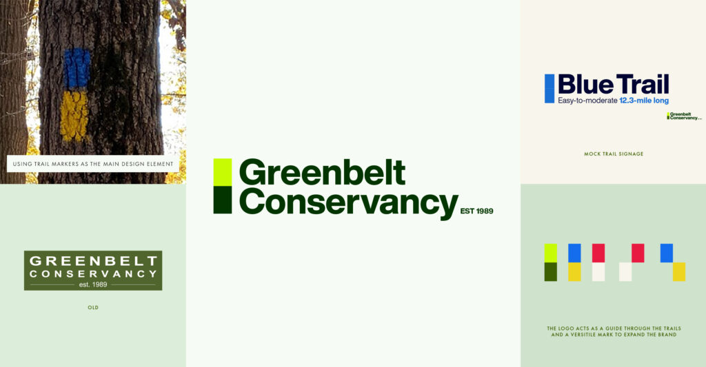
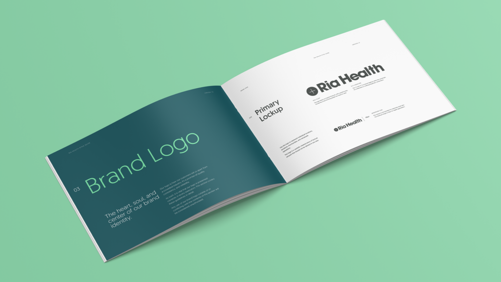
Does your Brand have a Style Guides? If not, you need one. If you do have a brand style guide and you aren’t using it, we need to talk. That guide is there to keep the brand consistent and cohesive. It’s a document that unifies your brand’s mission, values, visuals, and rules in one easy-to-read package. Not just for you, but anyone working on anything for your company.
“I already have a logo.”

Your logo is not your brand. Throw that thought right out of your head and into on-coming traffic. Just because you have a logo, doesn’t mean your branding journey is complete. A roof doesn’t make a house, but it does cap it off. The logo is the tip of a very large iceberg. You need to surround that bad boy with your values, messaging, complementary typography, colors, usage rules, photography, patterns, measurements. I could go on.
Life without a brand style guide

Pairing your logo with random fonts from your computer is sloppy. Using your favorite colors vs your brand colors in a presentation is selfish. Stretching your logo to fit a space instead of adhering to usage rules is disrespectful. These are all very direct, very true statements that are meant to illustrate how important a style guide is.
Here, I will provide a visual to illustrate my point.

If Apple sent you an email about a new watch and this typeface + logo + color scheme was used, would you trust the email? Even if it was an actual apple email? No, you would not. Why? Because Apple is brand consistent. They have rules about how the logo is displayed, what type to use (SF Pro Display, if you were wondering), the colors to surface, the way to phrase messaging, etc.
Now think back to every Keynote or Powerpoint you and everyone in your company have created without a style guide. Yea. I bet it’s a freaking circus.
Why do you need a Brand Style Guide?
Let’s recap:
- It maintains brand consistency across all mediums and channel (consistency = trust)
- Establishes rules for your brand to follow
- A single point of reference for all Brand needs
- Defines your Brand Typography (I can’t stress this part enough, type is so important. It’s literally what people read)
How to use a Brand Style Guide

Now you understand the importance, let’s talk about how to use a brand style guide to solidify your brand dominance.
Get a brand style guide
This is an easy one. if you don’t have one, get one. If you need one, I can help you. Whatever you do, stop not having one. Yes, that was a poorly written sentence, but damnit if it’s not accurate. The style guide will provide you with piece of mind, steadfast rules, and the tools to keep your brand consistent and ready to dominate.
Distribute your guide
Send that brand guide to everyone in your company with a priority email, Slack message, Asana ticket, Zoom call, or company-wide roundtable. Let them know there are rules to this game. Provide all the necessary files, typefaces, decks, color values, and rules to everyone, and if possible, schedule some training to give your people a crash course in staying on brand.
Adhere!
The key to consistency is also adherence. You have to stick with it. It’s time to break those nasty habits, like defaulting to Verdana because you like it, or clicking a color because it “pops.” If you were provided the necessary brand files, there is no guess work, no personal preferences, no questions. Follow the rules, and build that brand stronger than ever.
Digital or print. Pick your poison
We are in a digital world and style guides have adapted to that. You can build an online guide like Atlassian, or keep it traditional and create a pdf to share. Whatever route you choose, make sure it’s in easily accessible, clear, and modular. If you have a file, set up a Dropbox account, or a company Google Drive to house the file. Sharing a digital Brand Style Guide is as easy as copy and pasting a link and sharing via Slack, Jira, Asana, Discord, Email. I could go on. Get it in the hands of those who need it (remember, Distribute).
Keep it flexible
Brands grow, values change, and missions shift. Your style guide is no different. If your company begins serving a new target audience, it shrinks or grows, or you introduce a new product to the market, you may need to update that guide. That doesn’t mean throwing the baby out with the bathwater (a phrase I’ve always wanted to use), it means revisiting the guide and keeping it fresh. Rules aren’t meant to be broken, but they can be changed. Just remember not to change for the sake of busy work. If mission-critical items like values or missions change, acquisitions occur, or your logo is updated, have a design professional dive back into that guide and make the necessary changes, then let everyone know. Distribute, etc.
Bonus: Don’t resize your logo
Stop doing that. Don’t squish it, don’t squeeze it, don’t change the color, or add a background. Don’t “think you have the right one” or use a .jpg when you need a .png. Ask your designer to export the logo at the size, transparency, color, or variation you need. Please. PLEASE! Just ask (politely).
Sorry, I triggered myself.
Wrap up

Brand Style Guides provide your brand with rules to keep things in order, promote consistency (which garners trust) and gives your creatives parameters that allow for maximum (branded) creativity. Remember, your logo is not your brand, it’s your handshake. The brand is everything your company does, the way you say things, how your present the things you say, and cat memes.
Need help with your brand style guide? I can help. Reach out and let’s solve your design problems.

