Problem: Healthcare is difficult to understand and digitally navigate
Healthcare is difficult to understand for any age group. To clarify things, my team and I gathered user testing data and applied our findings to Zipari's Healthcare Product Suite.
Solution: User-researched and tested healthcare apps
We reduced the number of steps between a member and their ultimate goal of purchasing health insurance, finding a doctor, locating their healthcare ID card, and several other critical use cases plaguing members. The design team included a hefty dose of empathy in its thinking, as well as user testing and research, so we could identify more human-centered pain points along the design journey.
The result is human-focused UX/UI for Healthcare Product Design that continues to evolve, keeping end-users as the top priority.

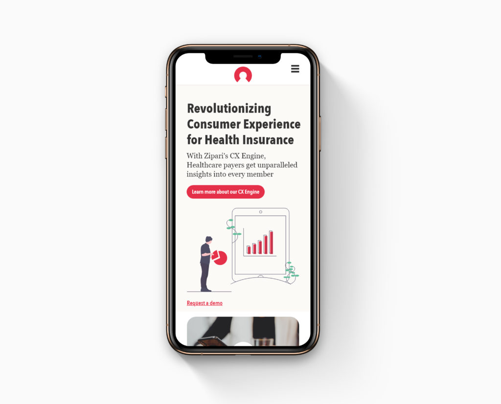
A connected ecosystem of healthcare apps
From a product design perspective, our goal was to create a connected ecosystem of health apps to aid a health plan's members in their care journey. That included Member portals, provider search apps, and our flagship, the health insurance Shopping portal (pictured below).

These white-label products were tested by potential users and designed to make the difficult process of shopping for insurance or finding a provider who takes that insurance as fast and easy as possible.
Product evolution
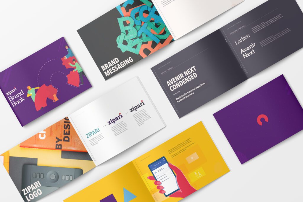
To help guide the future of these digital healthcare products, the team developed a component-based living style guide to govern the suite's UX and UI output. Initially built using Sketch, and Abstract for version control and collaboration, the design team crafted a unique and robust design system based on user feedback, testing, and research data.


Results:
Using our apps, our clients reported a 41% year-over-year increase in behavioral health usage, a 55% year-over-year increase in self-service (using our call center solution), and a 115% year-over-year increase in Telemedicine usage. We also received a 5-star Medicare Advantage Rating!